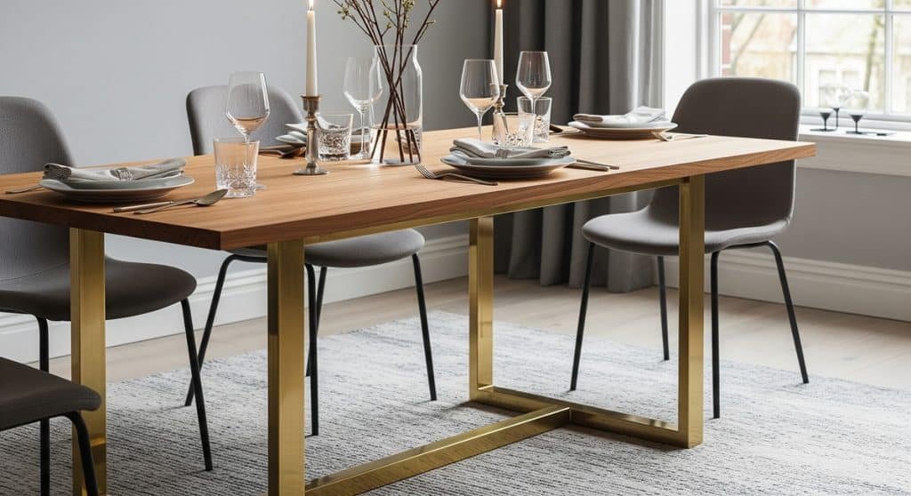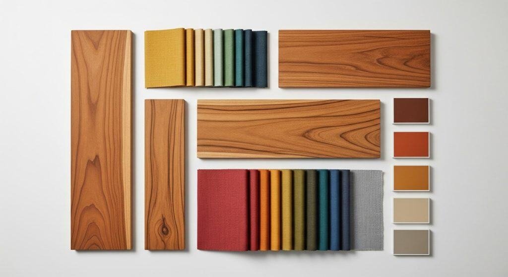
Finding the perfect color palettes for teak furniture is key to unlocking its full aesthetic potential in any design project. In interior design, color is the language of emotion, dictating a room’s mood and character. Teak wood, with its rich golden-brown hue, is a versatile “neutral” that can anchor a wide variety of sophisticated color schemes.
However, in the realm of commercial architecture and high-end hospitality procurement, executing these palettes on a tropical hardwood substrate is not just an aesthetic choice—it is an exercise in applied chemistry.
Tectona Grandis (Indonesian Teak) is a highly reactive, biologically complex material. Applying standard commercial finishes to achieve a specific “look” without accounting for teak’s internal oils and tannins results in catastrophic coating failures, severe yellowing, and bleed-through.
This guide explores five distinct professional palettes that work exceptionally well with teak’s natural warmth, while providing a manufacturer’s technical breakdown of the chemical specifications required to engineer them flawlessly for B2B deployments.
The Chemical Baseline: Understanding Teak’s Undertones
Before building a palette, specifiers must understand the substrate. Natural Indonesian teak is characterized by its warm, golden-brown color, with complex undertones of gold, honey, and amber.
Biologically, this color is accompanied by a high concentration of tectoquinones (natural wood oils), silica, and tannic acid. These compounds act as active chemical antagonists to many finishing agents. Achieving a stable color palette requires neutralizing or utilizing these biological realities to prevent delamination or extractive bleeding over time.
Each of the following palettes leverages a different aspect of color theory to create a distinct mood and style, showcasing the remarkable adaptability of teak furniture.
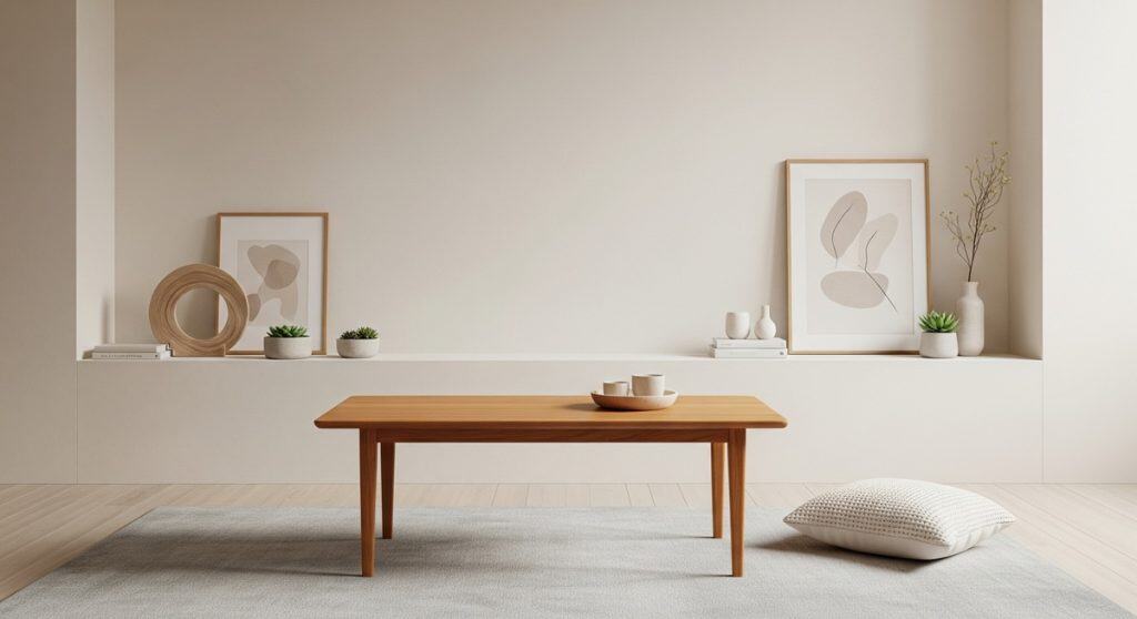
Palette 1: The Serene Neutral Palette (Japandi & Minimalist)
- The Mood: Calm, airy, minimalist, sophisticated. This palette is the foundation of Japandi and Scandinavian design.
- The Colors: A nuanced range of warm whites, soft beiges, creamy off-whites, and light, warm greys.
- The Aesthetic Goal: By surrounding teak furniture with soft neutrals, the focus shifts entirely to the material itself, leaving the wood looking “raw” and “unfinished.”
Manufacturer’s Technical Execution: Aliphatic Emulsions & Molecular Bonding
Standard solvent-based finishes possess an inherent amber tint that immediately darkens teak, ruining this raw aesthetic, and they yellow under UV light. To achieve the “raw” look against a neutral palette in high-traffic environments, we execute one of two engineered solutions:
- 2K Water-Based Aliphatic Acrylics: We utilize advanced, two-component water-based polymer emulsions. Because they lack petroleum solvents, these finishes are “water-white” and non-yellowing. We first apply a specialized 2K isolating primer to block water-soluble tannin migration, allowing the topcoat to cure into an invisible, highly durable, zero-VOC film.
- Hardwax Oils (Molecular Bonding): For boutique retail spaces, we deploy 0% VOC hardwax oils. Unlike film-forming finishes, these oils bond directly with the upper microns of the wood’s cellulose fibers on a molecular level, preserving the raw tactile sensation and pale tone while providing a hydrophobic barrier.
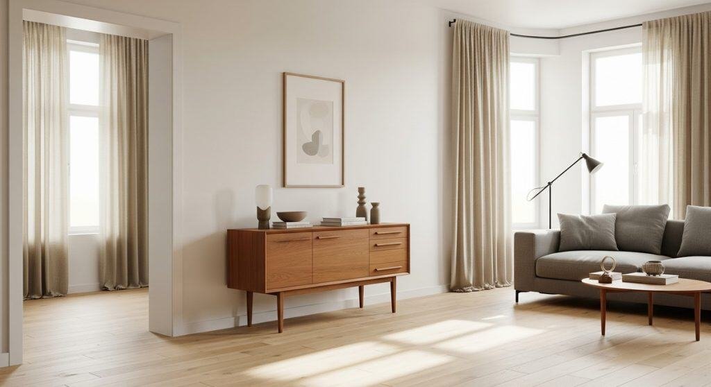
Palette 2: The Earthy & Grounded Palette (Biophilic Design)
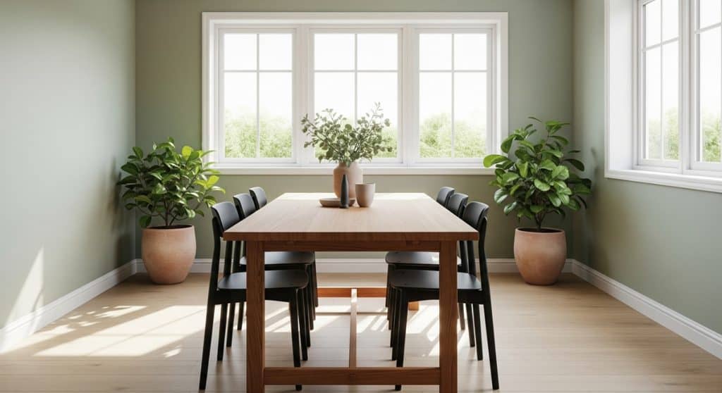
- The Mood: Warm, natural, cozy, and deeply connected to nature. This is the core palette for Biophilic Design.
- The Colors: Rich, earth-inspired tones such as terracotta, sage green, olive green, deep ochre, and warm taupe.
- The Aesthetic Goal: To enhance the organic, grounding quality of the teak wood, forging a direct visual link to the outdoors.
Manufacturer’s Technical Execution: Penetrating Natural Oils
Biophilic design emphasizes authentic, minimally processed materials. To complement this earthy palette, we avoid thick, plastic-like surface coatings. Instead, we specify deep-penetrating natural oils or advanced water-based coatings that protect the Grade A Indonesian Teak from the inside out. This preserves the pure tactile interaction between the user and the material, ensuring the wood remains “breathable” and texturally authentic.
Palette 3: The Deep & Moody Palette (Classic Luxury)
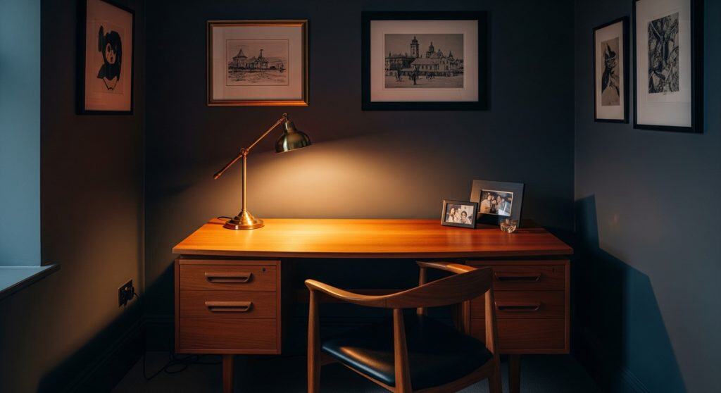
- The Mood: Dramatic, luxurious, sophisticated, and intimate.
- The Colors: Saturated, dark tones like charcoal grey, deep navy blue, forest green, and rich black accents.
- The Aesthetic Goal: The dark, cool tones of the surroundings create a powerful backdrop that makes the golden-brown teak “pop,” highlighting its grain contrast.
Manufacturer’s Technical Execution: Cross-Linking Polymerization
To stand out against a dark, moody backdrop in a commercial space (such as a high-end restaurant), the teak requires extreme clarity and supreme chemical resistance.
We utilize 2-Component Polyurethane (2K PU). Unlike evaporative finishes that simply dry, 2K PU requires an isocyanate hardener to catalyze the liquid resin. It undergoes a cross-linking polymerization process, binding the molecules into an incredibly dense, impenetrable matrix. This chemically locks in the warm, golden tones while providing the highest abrasion and chemical resistance available against ethanol and alkaline cleaners.
Palette 4: The Coastal & Breezy Palette (Modern Tropical)
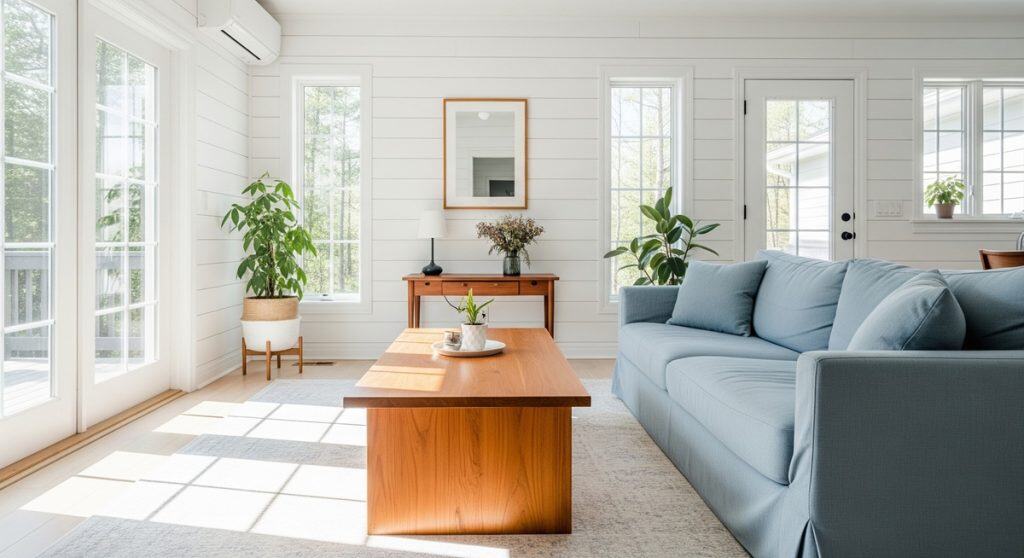
- The Mood: Relaxed, fresh, airy, and light.
- The Colors: Soft, cool blues (sky blue, seafoam green), sandy beiges, and crisp, clean whites.
- The Aesthetic Goal: To evoke the feeling of a modern seaside villa, where the warm teak grounds the airy environment.
Manufacturer’s Technical Execution: Mathematically Stable Oxidation
Coastal palettes often extend into transitionary indoor/outdoor resort spaces. Constant exposure to UV radiation (sunlight) and saline moisture is a severe chemical challenge.
When fabricating exterior architectural seating for coastal environments, the most technically sound finish is zero finish. Applying a film-building finish (like PU or lacquer) traps moisture beneath the chemical barrier, causing it to blister and peel. Left bare, the UV radiation breaks down the surface lignins of the wood. The teak oxidizes into a predictable, mathematically stable silver-grey patina. The structural yield strength remains 100% intact due to teak’s internal silica. For authentic coastal applications, true engineering means letting the material’s biology dictate the palette.
Palette 5: The Monochromatic Contrast Palette (Modern Graphic)
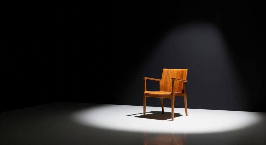
- The Mood: Modern, graphic, bold, and intentionally minimalist.
- The Colors: A strict palette of black, white, and various shades of grey.
- The Aesthetic Goal: The teak furniture becomes the sole source of warmth and organic texture against a stark, geometric background, often utilizing ebonized or dark-stained teak.
Manufacturer’s Technical Execution: Tannin Blocking and Translucent Glazing
Achieving dark, uniform tones (like deep espresso or charcoal) on teak is notoriously difficult. The varying density between the earlywood and latewood grain absorbs liquid stains at vastly different rates, often resulting in a blotchy appearance.
We do not use standard wiping stains. Achieving dark color palettes across a commercial rollout of custom made teak furniture requires a multi-step glazing protocol. We first seal the raw wood with a wash-coat to equalize surface absorption and block natural oils. We then apply precisely tinted, semi-translucent chemical glazes suspended above the wood fiber. This builds deep, uniform color while allowing the natural geometry of the teak grain to remain visible beneath the tint, finally locked down with a clear 2K PU topcoat.
Color Palettes as the Foundation of Style
The color palettes we’ve discussed are more than just complementary shades; they are the visual language of interior design. The choice of color is what helps define a room’s mood and is a critical element in creating a specific, cohesive aesthetic.
For example, the disciplined use of “Earthy Neutrals” is fundamental to achieving a serene modern minimalist interior, where the focus is on form and material. Similarly, the “Shades of Green” palette is a direct expression of biophilic design, helping to create a space that feels deeply connected to the natural world.
Understanding how to use color is the first step. The next is to see how these palettes are applied across different design movements. To continue your design journey, we invite you to explore our complete guide to timeless teak furniture styles.
Conclusion: Bridging Aesthetics and Applied Chemistry
In commercial B2B procurement, specifying color palettes for teak furniture cannot be divorced from the chemical realities of the substrate. An aesthetic choice is simultaneously an operational choice, dictating the maintenance schedule, repairability, and lifecycle of the product.
At Naramulya, we bridge the gap between design theory and material science. We engineer the exact chemical stack required to achieve your architectural vision while ensuring the coating physically cross-links, protects, and performs flawlessly in the most hostile commercial environments.
Let’s Create Your Perfect Palette
If you are a designer or homeowner looking for the perfect teak furniture to anchor your next project, we invite you to contact us. Let’s discuss how our craftsmanship can become the centerpiece of your unique design story.